Textile Museum of Canada Redesign
An information architecture and navigational structure redesign.
Duration: November - December 2023 (4 weeks)
Client: Textile Museum of Canada in the Information Architecture Course (Masters Level)
Platform: Responsive Web Design
Members: Brenda Hu, King Hei Lam, Siti Lei, Wan Sze Wu
Tools: Figma, Miro
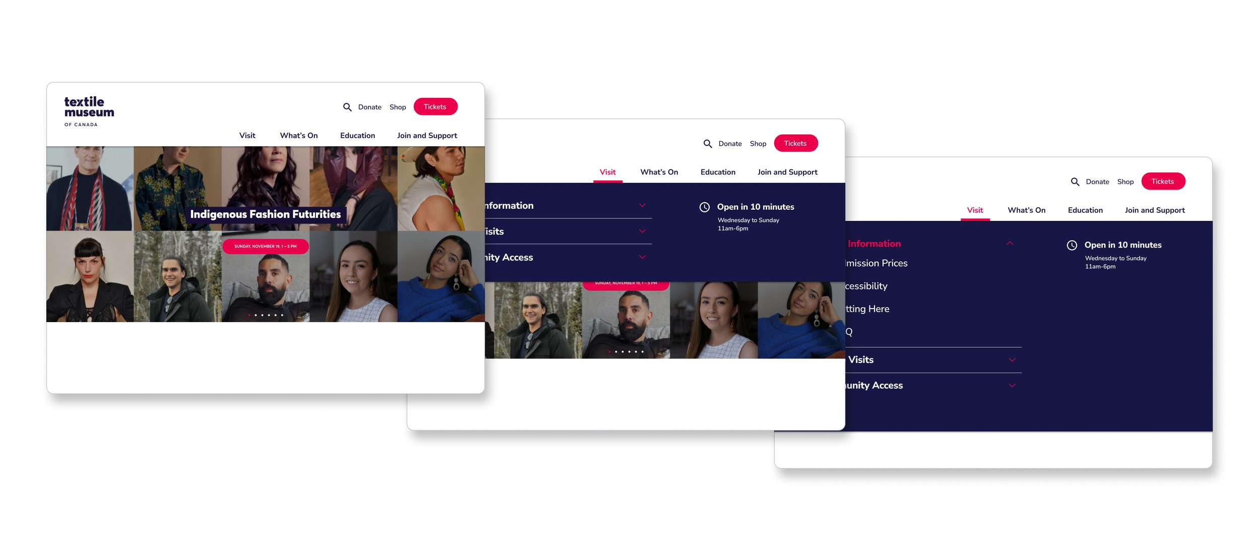
01 The Challenge
“How can the Textile Museum of Canada’s website structure be updated to align with COVID-19 induced organizational changes?”
The Textile Museum of Canada (TMC) has a longstanding tradition of preserving and showcasing the world’s textile heritage. However due to the COVID-19 pandemic, the TMC had many changes in its business objectives that were no longer reflected in their website.
This re-design was done through conducting content analysis, card sorting, and tree testing.
My Roles and Highlights
My main roles during this project include:
Organizing the execution of content analysis, card sorting, tree testing
Analyzing the obtained results from these methodologies
Translating insights into actionable design decisions
Designing low-fidelity and mid-fidelity wireframes and prototypes in Figma
Creating a report to present to major stakeholders of the Textile Museum of Canada
Presenting project work to user experience design experts
02 Lets Begin - Content Analysis
Does the content on the website reflect the organization’s current needs?
First, we wanted to understand existing content and its structure, to identify gaps and opportunities to support the user journey.
We evaluated 130 pages of the site based on 6 criteria: user needs, key messages, tone of voice, clarity, connection to strategy, and adherence to web accessibility standards. Our main findings were:
Strength:
Exhibition content is relevant and comprehensive
Exhibition activities and descriptions are prominently displayed in clear, plain language for easy understanding.
Challenge:
Event and workshop content is outdated
Many past events are still being listed as upcoming events, hindering users from getting relevant information.
Challenge:
Disconnect between headings and page content
Page headings often lack clarity, confusing users seeking specific information.
This analysis revealed the reasons why the current organization of content was confusing for its users.
Therefore the next steps were to use card sort analysis to find how the content could be re-organized to align with users’ expectations.
03 Card Sorting
How should the information be re-organized?
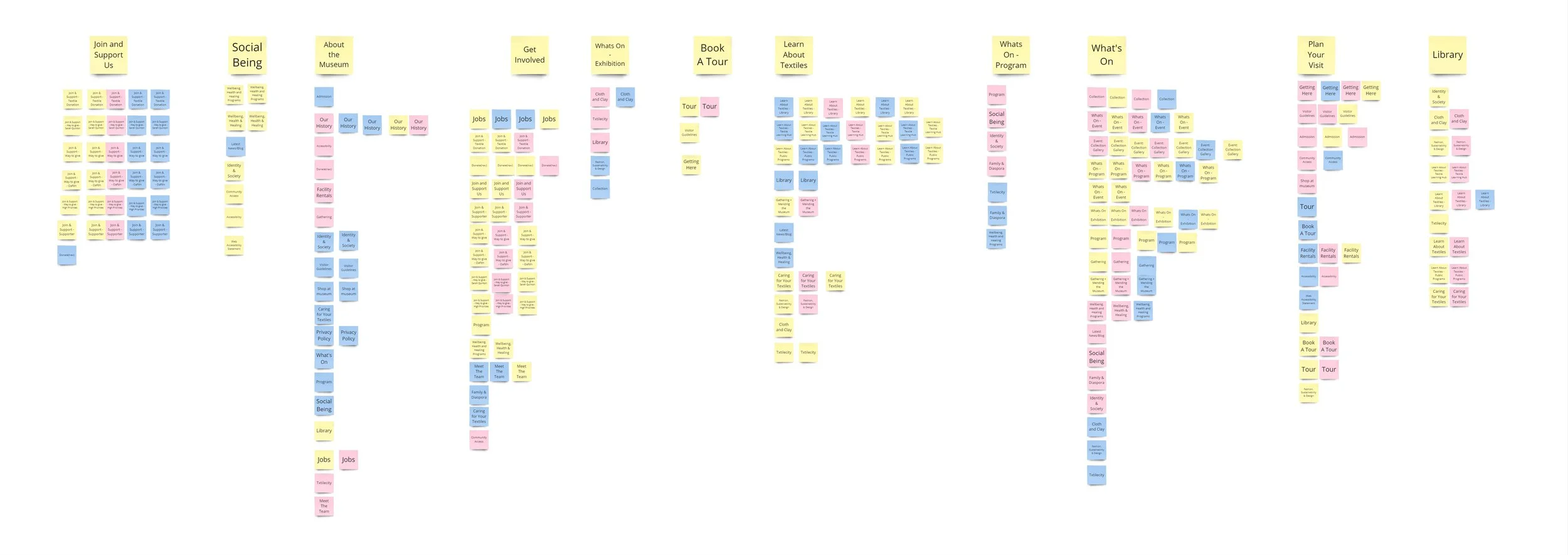
Using card sorting, we wanted to gain insight on user’s expectations, to ensure that the final information architecture aligns with user’s mental models.
We tested 8 participants in a 50-card open sort test, and the following major findings are:
Ambiguous labels & jargon
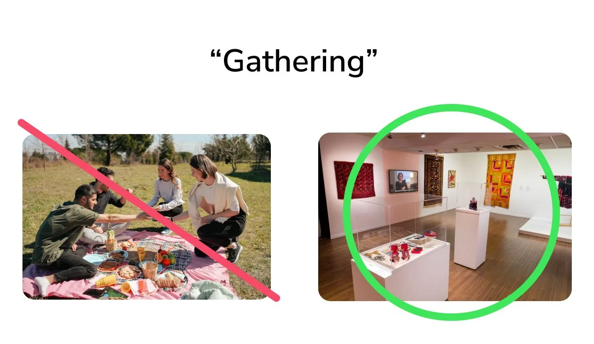
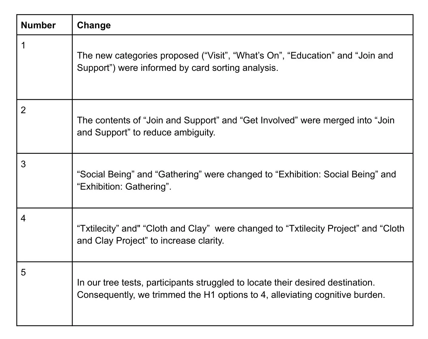
Cards with non-descriptive labels such as “Social Being”, “Gathering”, “Txtilecity” and “Cloth and Clay” posed sorting challenges as participants were unsure of their meaning.
This meant these labels had to be changed to be more clear.
Too-similar labels
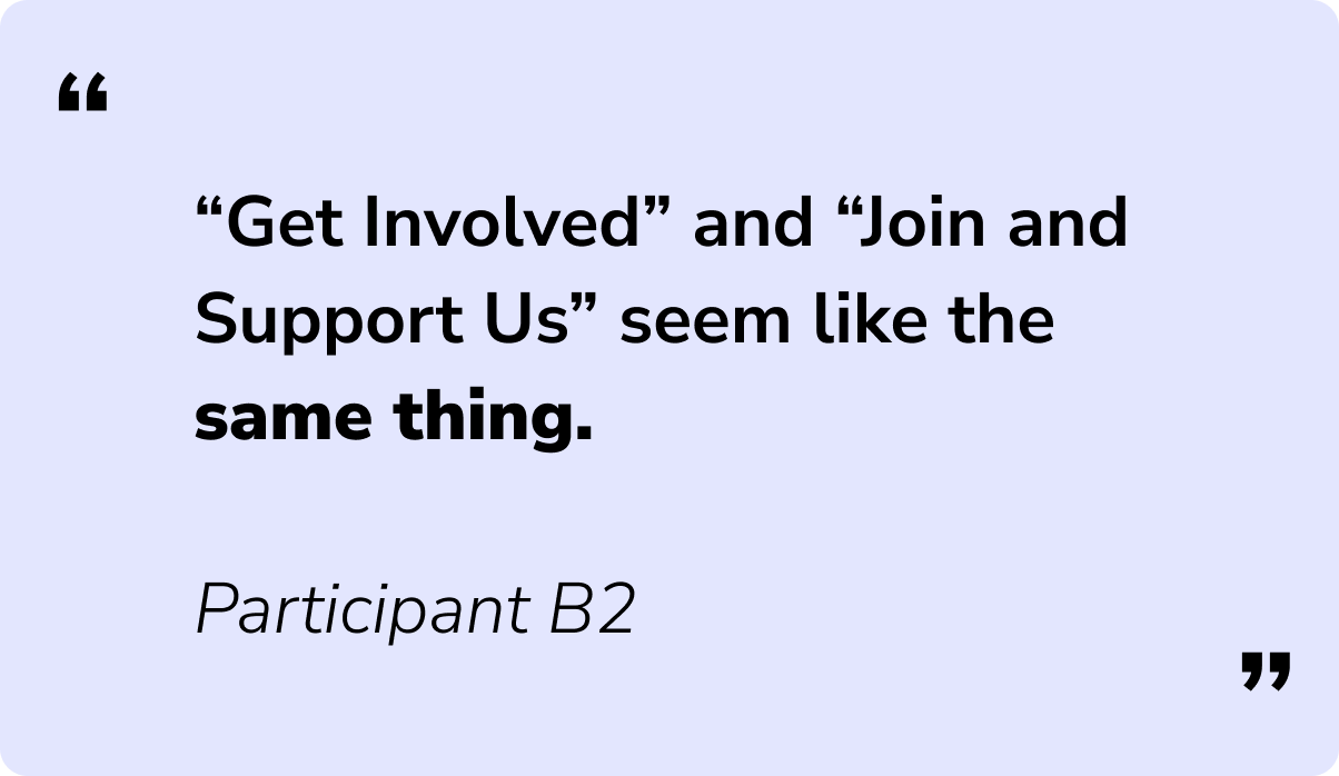
Participants had a difficult time telling the difference between “Get Involved” and “Join and Support Us”.
This meant we had to either merge these labels together, or make them more distinct.
Unsorted cards to become utility bar
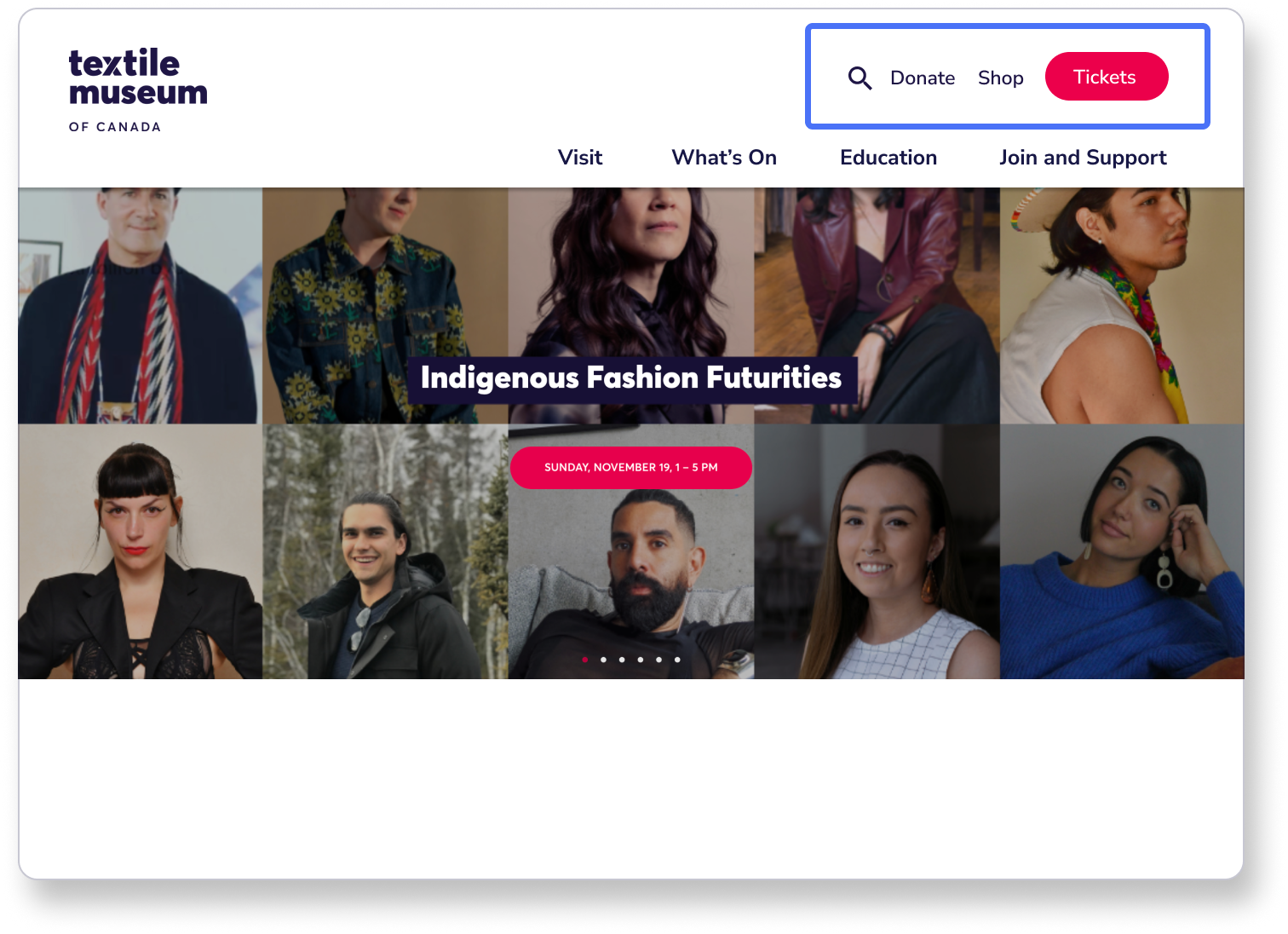
Participants had a difficult time categorizing “Donate”, “Shop” and “Tickets”, leading to split agreements.
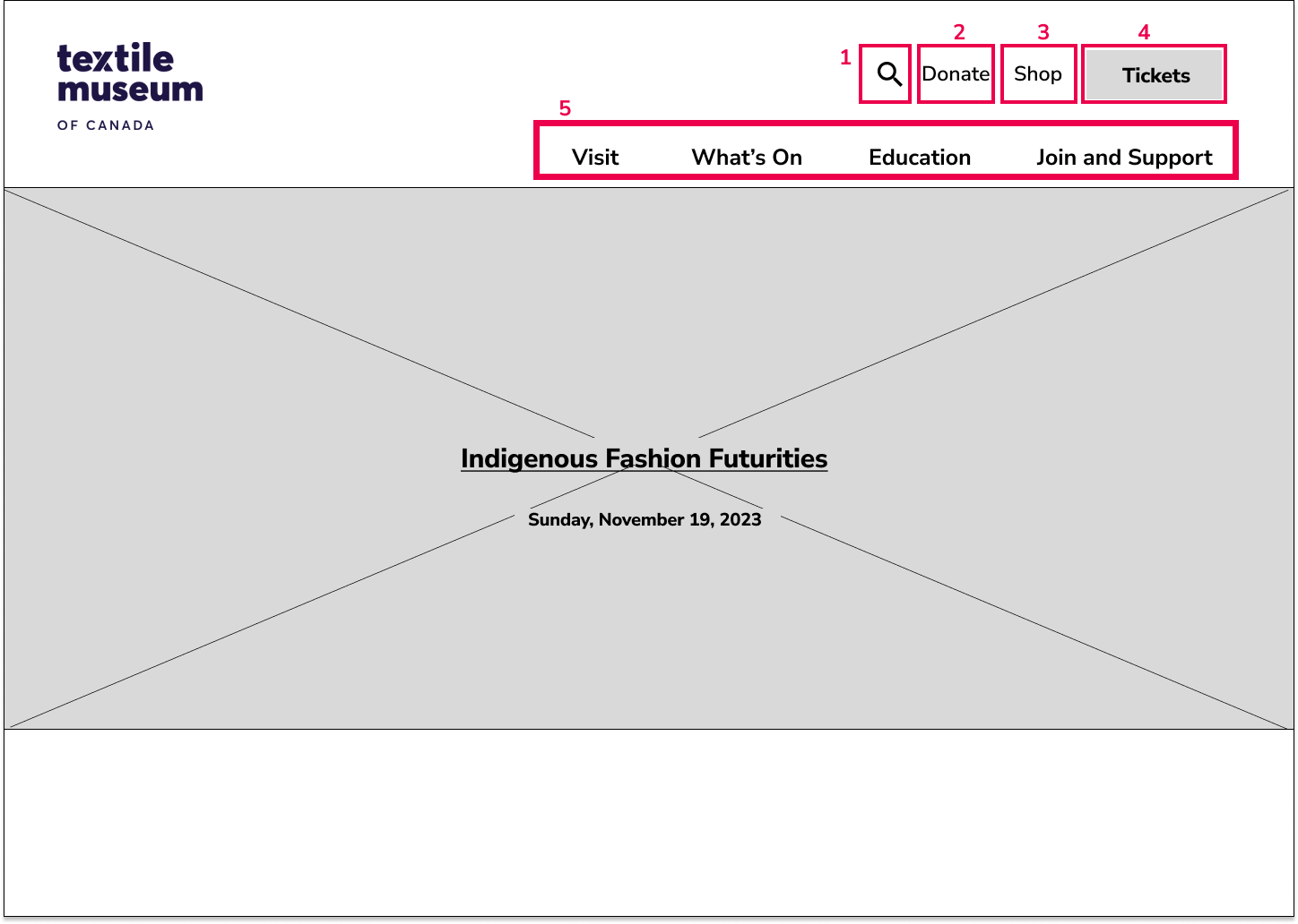
Therefore we separated them to become utility icons, and not part of the main navigation menu.
04 Tree Testing
Does the new information architecture structure work?
Using these card sorting results, we created a preliminary information architecture diagram. We then needed to know how this structure would fare in the hands of users, therefore we needed to conduct tree sort analysis. Our major findings were:
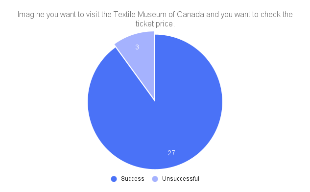
Strength: 29/32 participants were able to find how to get to admission prices.
Buying tickets and checking admission prices online were one of the main issues the museum’s website was facing.
This tree test shows that with our new navigational structure, visitors are easily able to find the information they need.
Weakness: Only 15/37 participants were able to find how to get to the job listings.
We found that many participants would go to
About the museum -> Meet the Team
However, the correct path was
Support the museum > Jobs
To solve this, we moved “Meet the Team” to belong under “Support the Museum”, where other career-related resources were located.
As a result, 30/32 participants in our second tree test were able to find the correct destination.
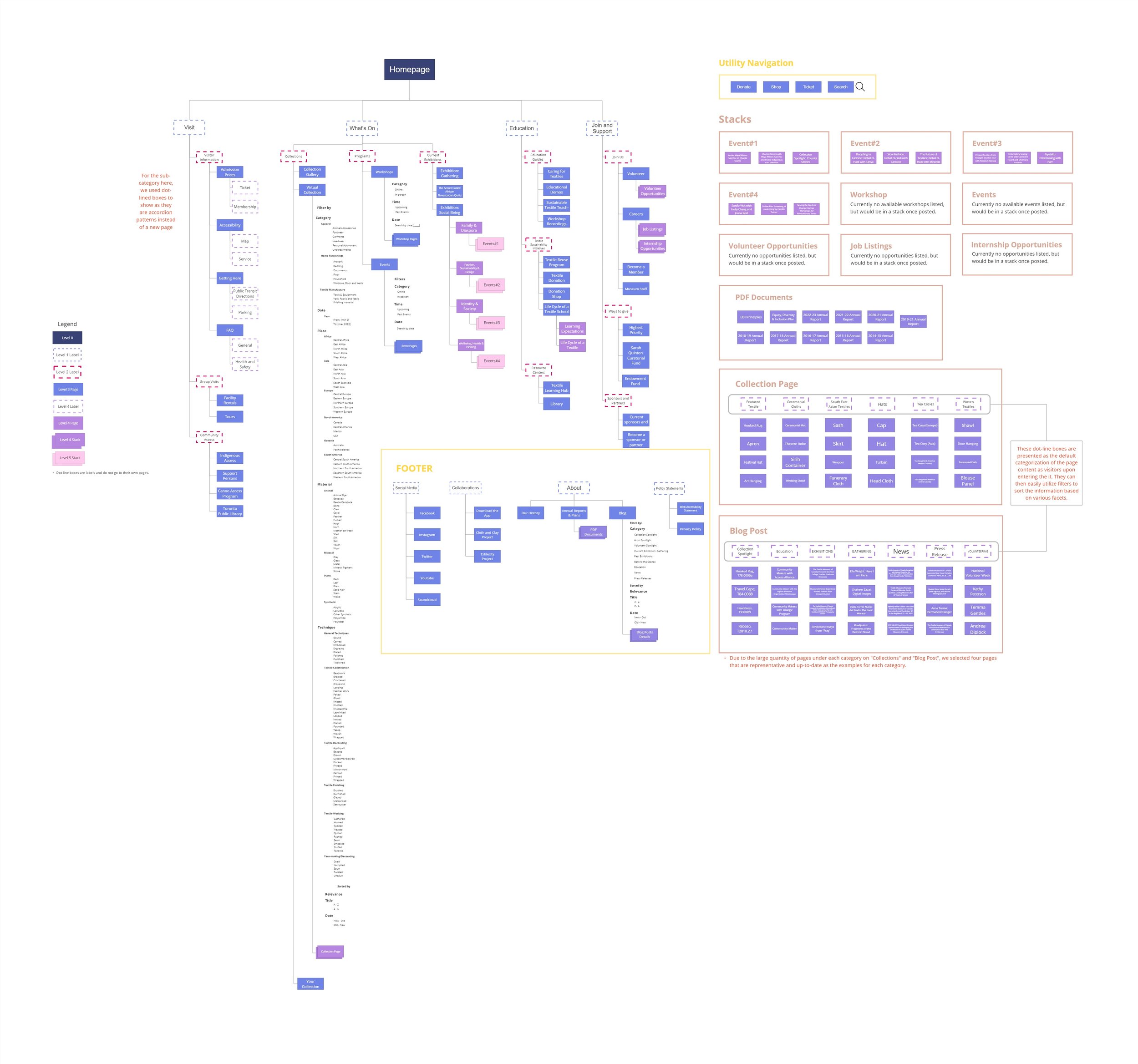
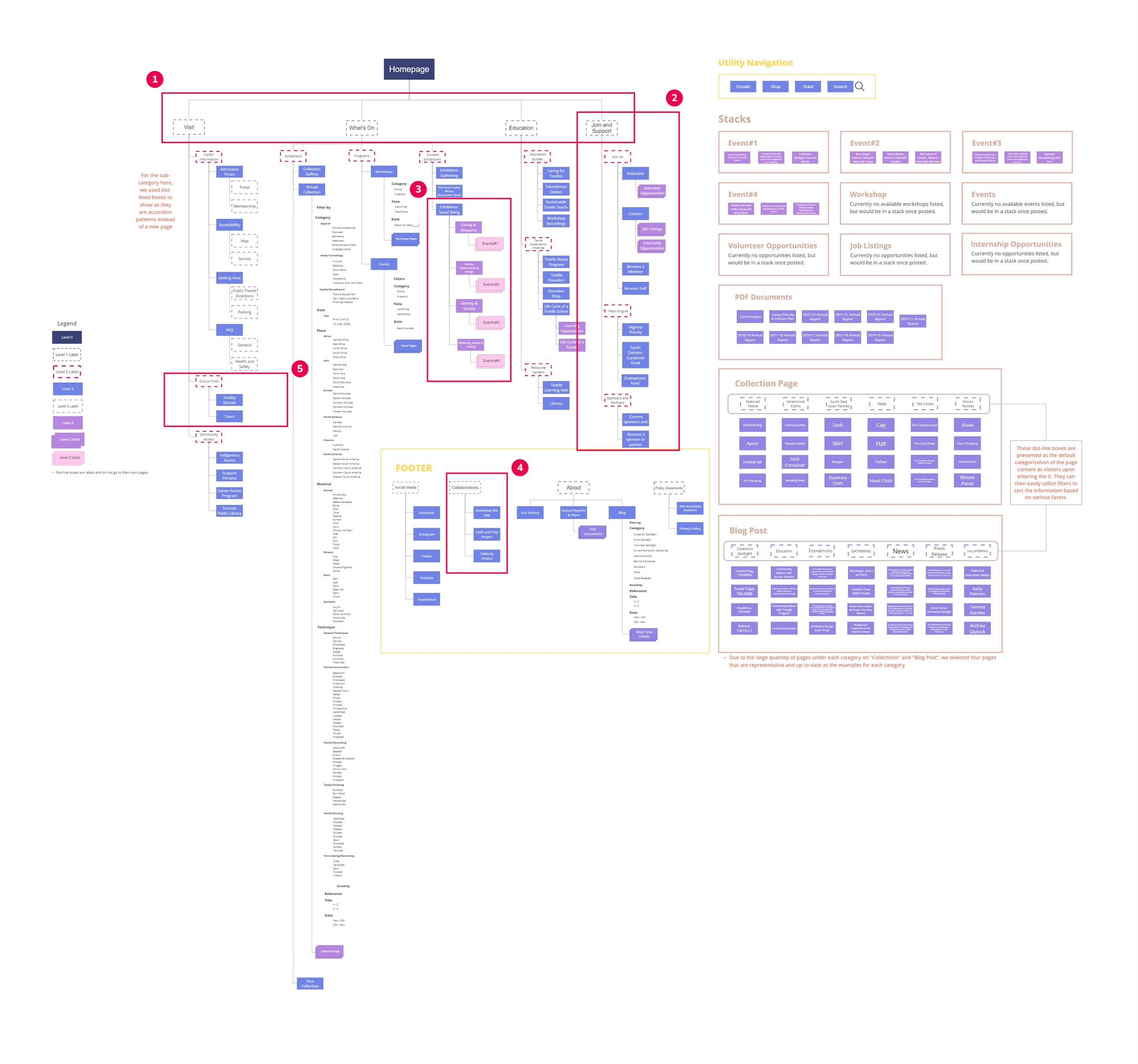
05 Final Information Architecture Diagram
How should the website be structured?
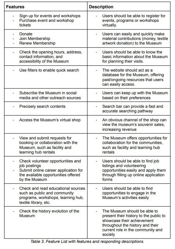
Using these card sorting and tree testing results, we created our final information architecture diagram and feature list.
06 Navigation Design
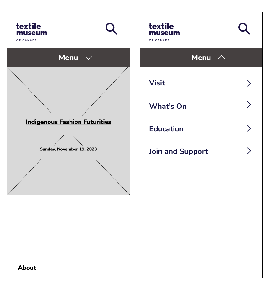
Desktop and Mobile Wireframes
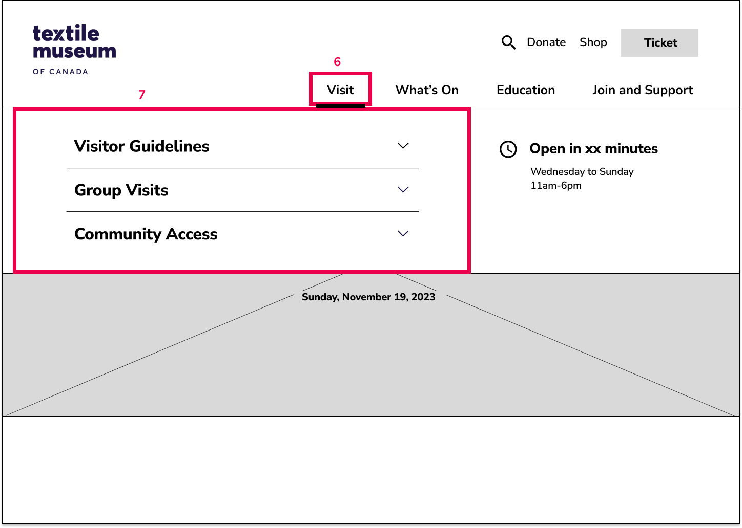
The information architecture diagram was then translated into a responsive web design. The wireframes are shown below.
06 Navigation Design
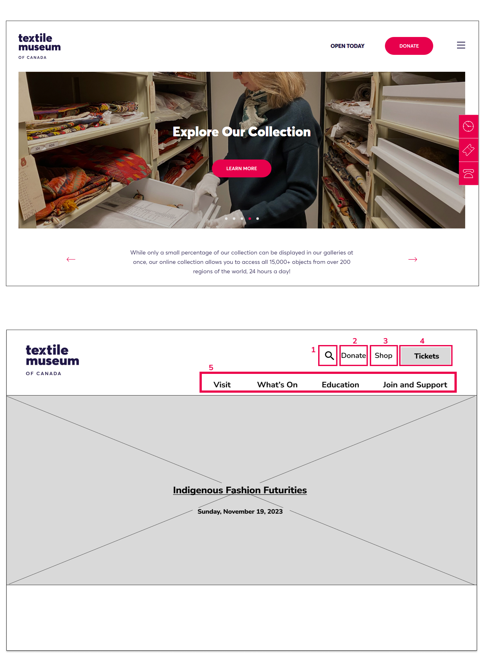
What were the major changes we proposed?
Hamburger Menu to Navigation Bar
The current main navigation (top) uses a hamburger menu. Although it reduces clutter, it hides important navigational elements.
Therefore in our new proposal (bottom) we utilized a navigation bar (5) . This increases visibility of important content, catering to the needs of the older audience.
New Utility Bar
The museum was concerned that users were unable to find how to purchase online tickets.
The implementation of a utility bar (1-4) brings these important functions up the level of hierarchy, improving visibility.
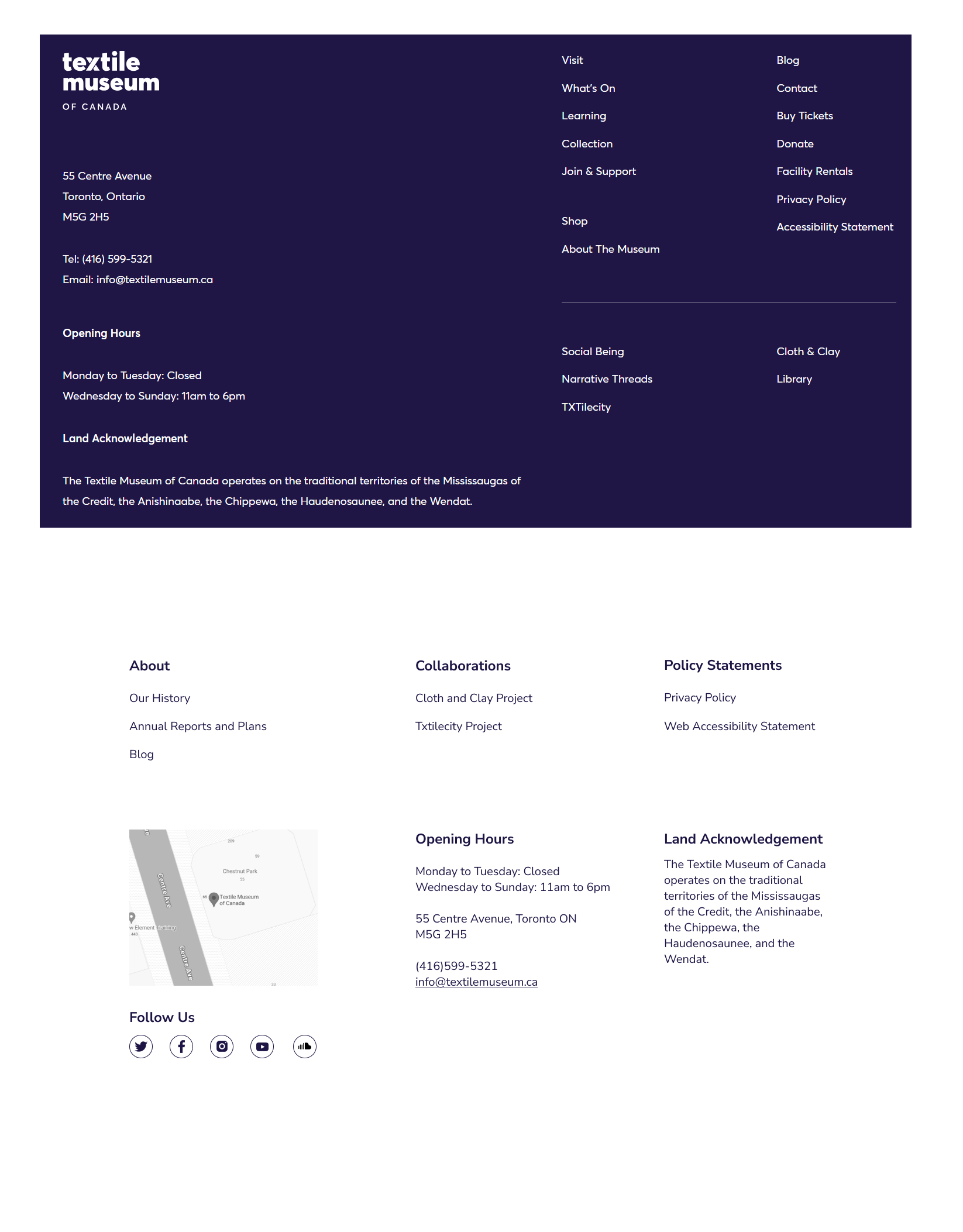
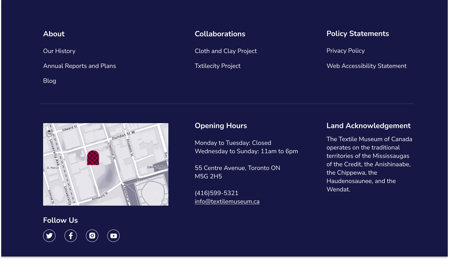
Re-organizing the Fat footer
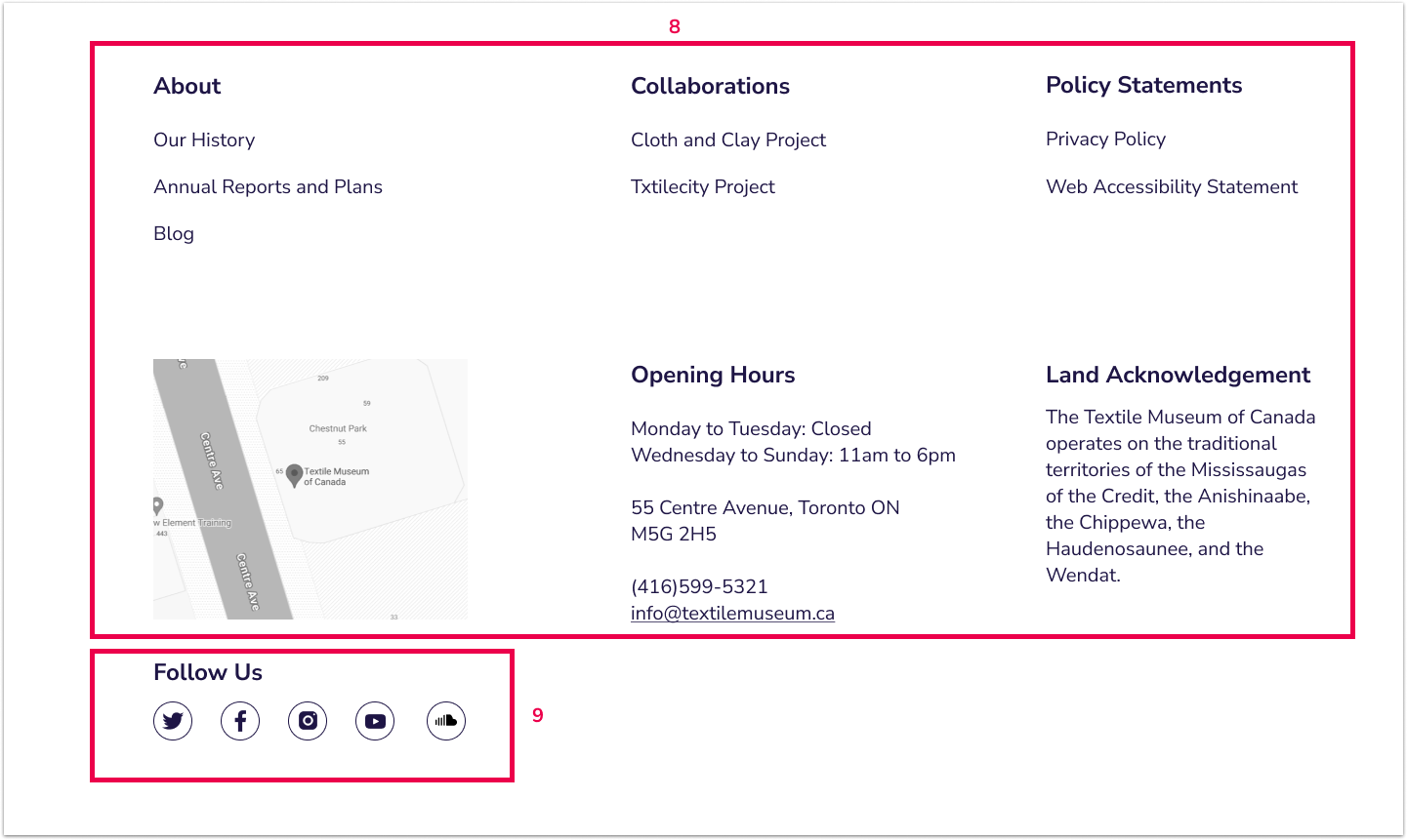
The original design (top) contains a fat footer, which we kept in our newly proposed design (bottom).
The fat footer allows users to see many links at a glance. However, in the original design there was no clear organization of content.
Therefore in our new design, we organized the links into categories, to be able to find information quicker and easier.
06 Navigation Design
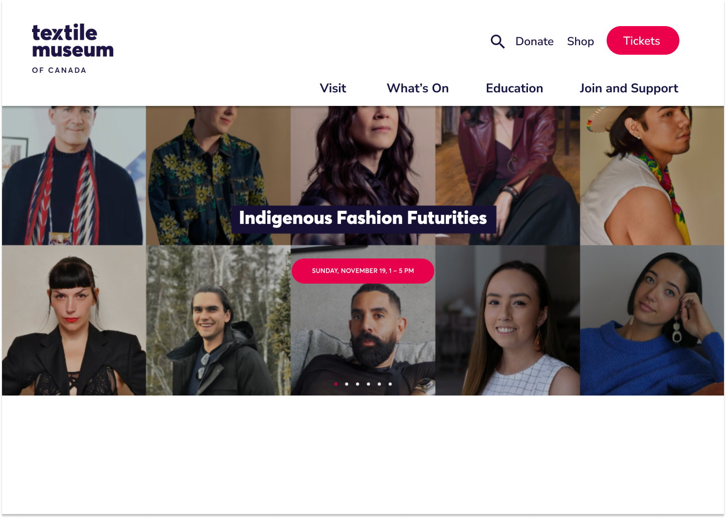
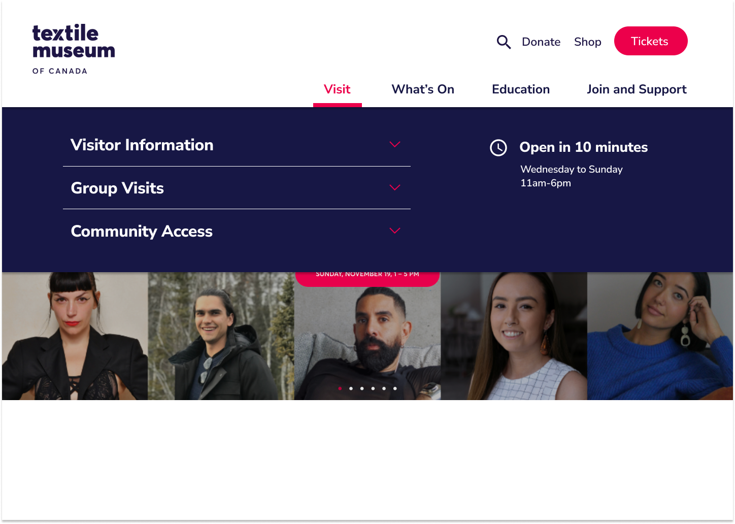
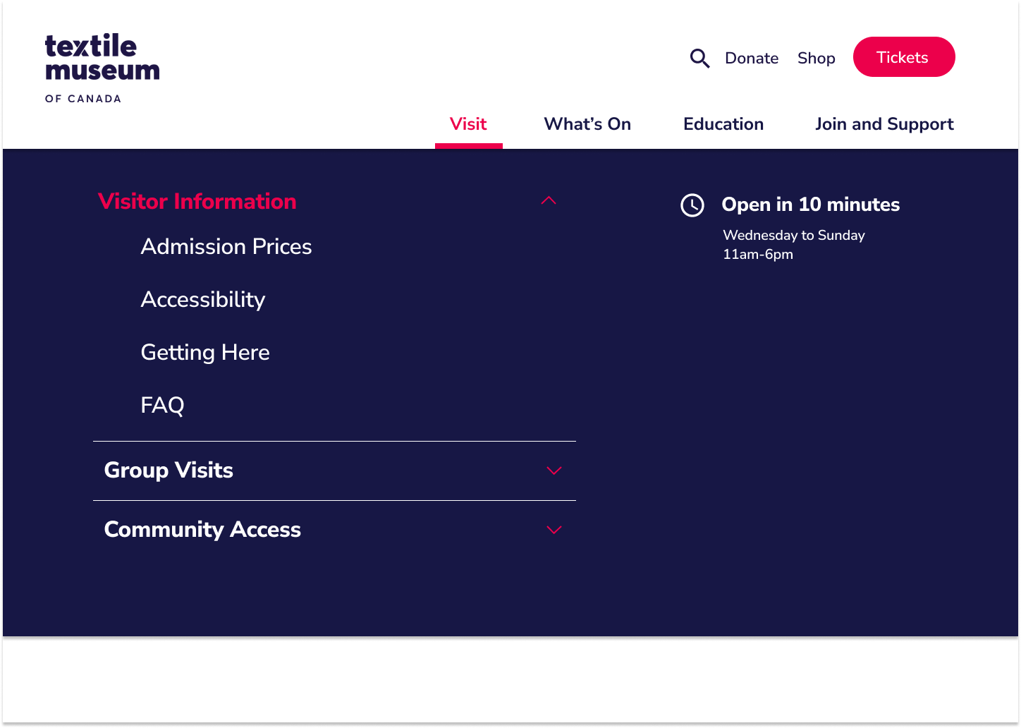
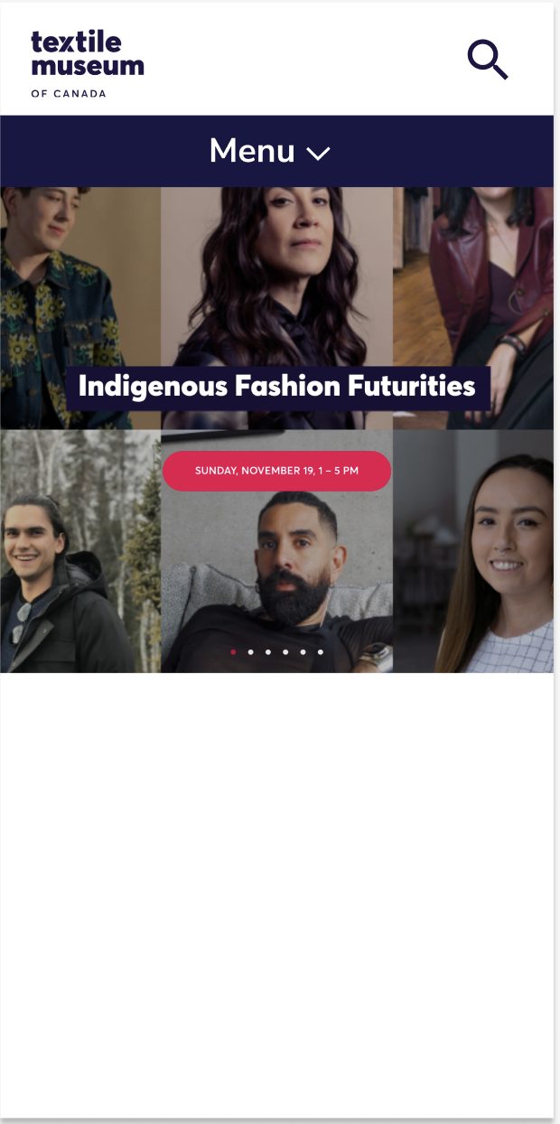
High-fidelity mockups
To show how our proposal could look realistically implemented, we created high-fidelity mockups. The desktop and mobile viewport designs are shown below.
07 Outcomes and Next Steps
Summary
After 4 weeks, the project came to completion and we were able to present our proposal to the Textile Museum of Canada’s CEO. We received positive feedback, particularly on how our solutions were realistically implementable to solve some of the biggest barriers to the site.
With the new design, visitors to the Textile Museum of Canada’s would have an improved digital visitor experience, strengthening the museum’s connection with the community.
Measurements of Success
The website overhaul was strategically aimed at specific performance metrics in the Textile Museum of Canada’s 2020-2021 Annual Report, including social media and community engagement. Financially, the website revamp is expected to increase revenue from supporter enrollment and online ticketing.
To facilitate these goals, the navigational re-design to improve website organization and accessibility caters to a broader audience, including those who are not as technologically inclined. Success in these areas will be gauged by an extended average session duration and a decreased bounce rate, reflecting increased user interaction with the website.
Lessons Learned
One of the key takeaways from the experience was navigating the challenges of meeting the diverse requirements of various stakeholders. There were multiple “correct” solutions, depending on the stakeholder being addressed, and writing a stakeholder analysis with each group’s characterization, needs, and key tasks to reference to proved to be extremely useful when making these decisions.
If I were to do this project again, I would conduct usability testing on the current website first, to find any key concerns that users had. This would allow us to suggest improvements the museum to be able to slowly implement in the short-term with their current structure, as they work towards the long-term goal of a complete revamp.
Next Steps
The next steps would be to conduct usability testing on our newly proposed design, and to implement usability testing feedback.
We would also take a deeper dive into the organization of the “collections” filters, working closely with the curators of the museum to update the categorization. For example one filter category had a total of 243 subcategories under it, and more than 85 of these categories had less than 10 items in them. Refining these filters would greatly improve the search experience for textile researchers.
